Multi-Family Archives | Ad Light Group
-1
archive,tax-portfolio_category,term-multi-family,term-133,stockholm-core-2.4.4,select-child-theme-ver-1.0.0,select-theme-ver-9.12,ajax_fade,page_not_loaded,,qode_menu_,wpb-js-composer js-comp-ver-7.9,vc_responsive
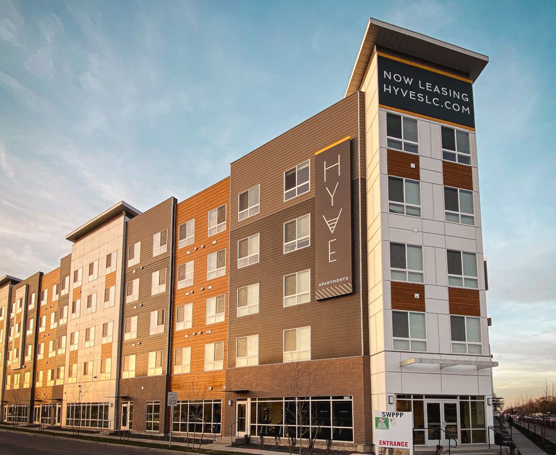
Morning view of the Hyve wall sign with modern approach to Salt Lake City signage

HYVE – Salt Lake City Signage for Superior Multifamily Living

In the world of modern multifamily living, the right signage can make all the difference. Ad Light Group, in collaboration with Forum, recently embarked on another successful project that exemplifies this synergy. We had the privilege of providing design, fabrication, installation, and permitting services for the Hyve, a 296-unit apartment complex nestled in the heart of Salt Lake City. This project not only showcases our commitment to excellence but also highlights the art of creating multifamily Salt Lake City signage that mirrors the contemporary lifestyle offered by urban communities.


Designing for Elegance


Taking Salt Lake City Signage to New Heights


The first step in the journey of creating exceptional multifamily signage for Hyve was the design process. Ad Light Group worked closely with Forum to transform their branding package into a comprehensive sign family. This sign family not only met the stringent code requirements of Salt Lake City but also encapsulated the elevated design that is synonymous with modern multifamily developments.


The goal was clear: to mirror Hyve’s elegance and make a statement through the design. The east façade, in particular, features two striking sign cabinets mounted to the parapet, accompanied by a pendant wall sign on the south side. On the south entrance, a branded projecting sign and a Leasing Center blade guide prospective residents to their reserved parking spots. These elements, harmoniously integrated into the architecture, add a touch of sophistication to Hyve’s visual identity.


Crafting Exterior Signage with Street Appeal
 

Morning view of the Hyve wall sign with modern approach to Salt Lake City signage

Elevate your urban living experience with Hyve’s elegant wall sign

Striking the Perfect Balance


The exterior signage design was a meticulous process that involved close collaboration with stakeholders and a deep understanding of Salt Lake City’s sign code regulations. Ad Light Group, in alignment with Forum’s vision, sought to maximize street appeal while adhering to these regulations. The result is a visually captivating design that not only attracts attention but also complies with the city’s stringent guidelines.


The aesthetics of the design are not just about branding; they also play a pivotal role in creating a sense of community and identity for residents. The design and placement of these elements were meticulously planned to enhance the overall visual experience of the Hyve complex while ensuring that they seamlessly blend with the surroundings.


Precision in Fabrication


Creating Design Masterpieces


The fabrication of the design elements was carried out at Ad Light Group’s state-of-the-art facilities. Our dedicated interiors team, metal fabrication team, and paint team collaborated to turn the designs into tangible masterpieces. Precision and attention to detail were paramount during this phase to ensure that the final products meet the highest quality standards.


From the selection of materials to the color palette and finishing touches, every element was carefully curated to bring the design to life. The end result is a set of design elements that not only withstand the test of time but also add a touch of elegance to the Hyve’s exterior.


Seamless Installation
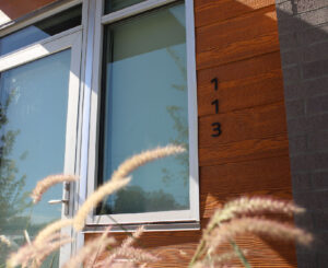
Unit entry sign on rustic wood paneling, a welcoming feature at Hyve in Salt Lake City.

Hyve’s unit entry sign, set against rustic wood paneling, creates a warm and welcoming atmosphere in the heart of Salt Lake City.


Coordinating Excellence


The installation process was a well-coordinated endeavor. Ad Light’s project managers maintained constant communication with the Hyve site team to ensure that the installation was carried out flawlessly. This meticulous planning and collaboration not only ensured the safety of the installation crew but also prevented any disruptions to the ongoing construction.


Ad Light’s installation crew used specialized equipment to install the design elements with precision and efficiency. When necessary, they also coordinated site logistics to ensure a smooth and safe installation process.


Conclusion:

In summary, the Hyve project stands as a testament to the power of design elements in elevating the aesthetics and functionality of multifamily developments. Ad Light Group’s commitment to excellence, from design and fabrication to installation, ensures that projects like Hyve reflect the modern lifestyle that urban communities aspire to offer.


If you’re embarking on your next Salt Lake City signage project and seeking to create design elements that capture the essence of your development while complying with local regulations, Ad Light Group is your trusted partner. Our expertise, attention to detail, and commitment to quality will ensure that your project shines as brightly as the Hyve. Contact us today, check out our other projects on Instagram, and let’s transform your vision into a stunning reality.

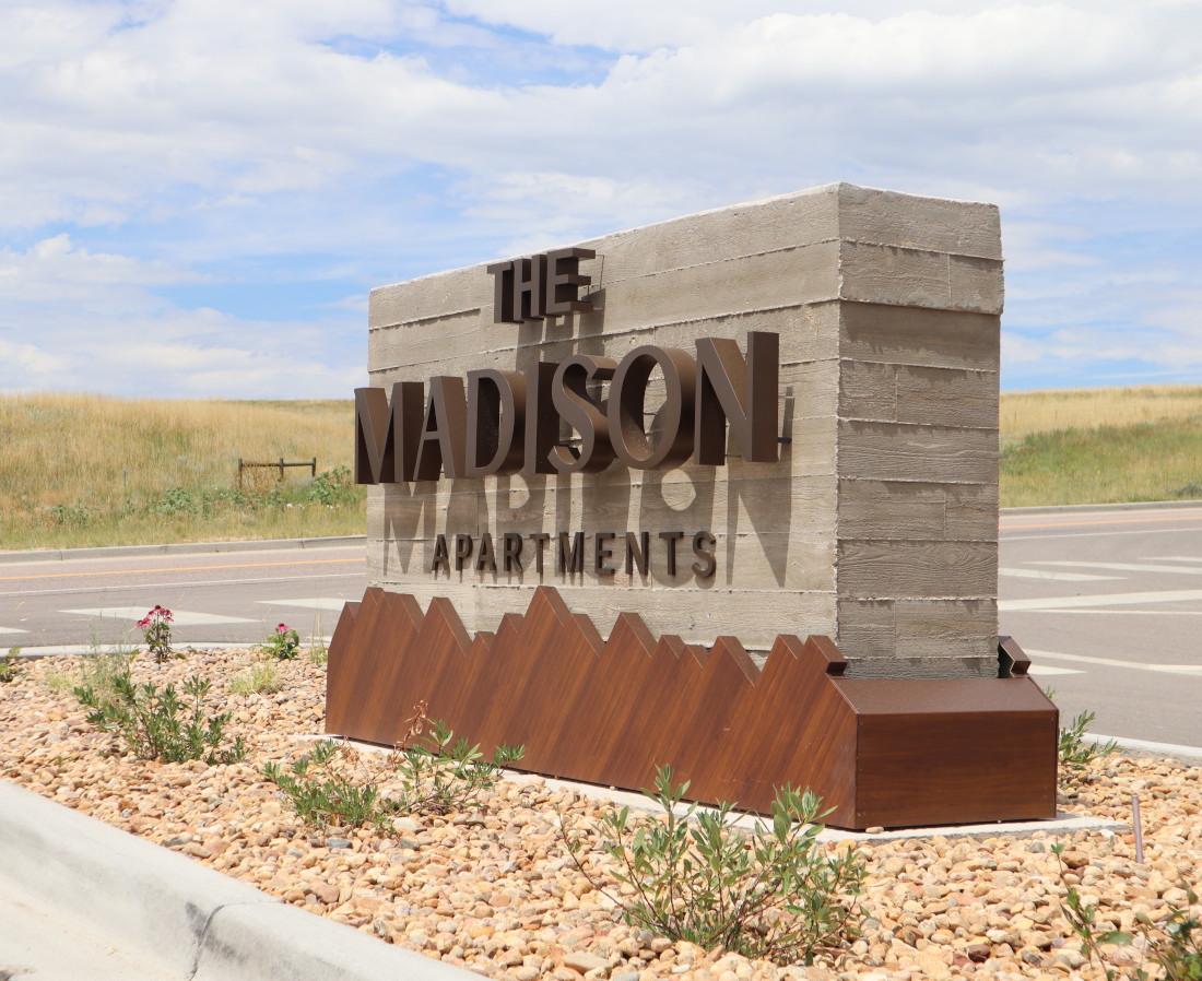
The Madison Board Form Concrete Monument

Unlocking the Beauty of Board Form Concrete: The Madison’s Monument Signage

When it comes to creating a lasting impression, it’s essential to pay attention to even the smallest details. At The Madison, a picturesque property developed by BMC Investments, this philosophy reigns supreme. Ad Light Group, in collaboration with BMC Investments, embarked on a remarkable journey to bring this vision to life. The result? A breathtaking board form concrete monument and other innovative signage solutions that seamlessly blend with the natural beauty of the surroundings.


Board Form Concrete: A Unique Canvas


Board form concrete is more than just a building material; it’s an art form. It’s the perfect medium to bridge the gap between modern architecture and the rustic charm of The Madison’s natural surroundings. This concrete monument serves as both functional signage and a captivating work of art, creating a distinctive sense of place.


The Madison: A Natural Oasis

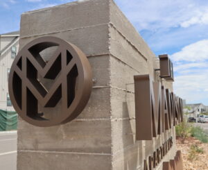
Close-Up of The Madison's Board Form Concrete Monument

A detailed close-up of The Madison’s board form concrete monument, showcasing its exquisite craftsmanship.


Nestled within a serene neighborhood, The Madison harmonizes effortlessly with the rolling prairies that frame its landscape. This deliberate connection to nature was the inspiration for the signage project. Ad Light Group, building on the branding package crafted by Fifty3, embarked on a creative journey that would result in an exceptional sign package, with the board form concrete monument taking center stage.


Creating Signage Family Concepts


Ad Light Group’s task was to develop signage concepts that complemented the garden-style complex and its natural surroundings. The board form concrete monument was the crowning jewel in this intricate puzzle. With meticulous planning and craftsmanship, it was designed to harmonize with architectural elements from the complex and the surrounding landscape.


The Elegance of Materials


The sign package at The Madison is a testament to the versatility of materials. In addition to the board form concrete monument, other materials like routed aluminum panels, digitally printed graphics, and raised photopolymer for ADA panels were utilized. Each material was carefully chosen to serve its purpose while contributing to the overall aesthetic appeal of the project.


1. Board Form Concrete Monument: A Timeless Touch


The heart of the signage project at The Madison lies in its board form concrete monument. This iconic structure not only guides residents and visitors but also stands as a symbol of the property’s commitment to aesthetics and functionality.


2. Natural Integration: Blending with the Landscape


The board form concrete monument at The Madison isn’t just a sign; it’s an integral part of the landscape. Designed to mimic the textures and tones found in the natural environment, it seamlessly blends with the surroundings.


3. Architectural Alchemy: A Marriage of Style and Substance


The board form concrete monument showcases an architectural alchemy that marries modern design with rustic charm. It embodies the property’s commitment to a timeless and elegant aesthetic.


4. Signage as Art: Functional Beauty

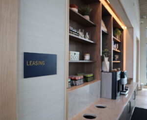
Close-Up of The Madison's Interior Photopoly Leasing Sign

A close-up of The Madison’s interior photopoly leasing sign, showcasing its elegant design.


At The Madison, signage isn’t just functional; it’s a work of art. The board form concrete monument stands tall as a captivating sculpture that enhances the property’s visual appeal.


5. Eco-Friendly Signage: A Sustainable Choice


Incorporating board form concrete into the signage strategy also aligns with The Madison’s commitment to sustainability. Concrete is a durable and eco-friendly material that will endure for generations to come.


6. Craftsmanship Beyond Compare


The board form concrete monument at The Madison is a testament to Ad Light Group’s exceptional craftsmanship. Each piece is carefully molded and finished to perfection, ensuring it will stand the test of time.


7. A Lasting Legacy: The Madison’s Signature


The board form concrete monument at The Madison isn’t just a sign; it’s a signature of the property’s commitment to excellence, aesthetics, and a profound connection with nature.


In conclusion, The Madison’s board form concrete monument is more than just a sign; it is a celebration of artistry, craftsmanship, and a harmonious blend with nature. This monument serves as a testament to the property’s dedication to creating a unique and memorable living experience. At The Madison, every detail, down to the signage, has been meticulously designed to enhance the beauty of the surroundings and leave an indelible mark on those who call it home.


If you’re interested in exploring more of The Madison’s stunning board form concrete monument and the breathtaking natural surroundings, don’t forget to follow us on Instagram for exclusive glimpses. For inquiries or to schedule a visit, please don’t hesitate to Contact Us. Your journey to an extraordinary living experience awaits!

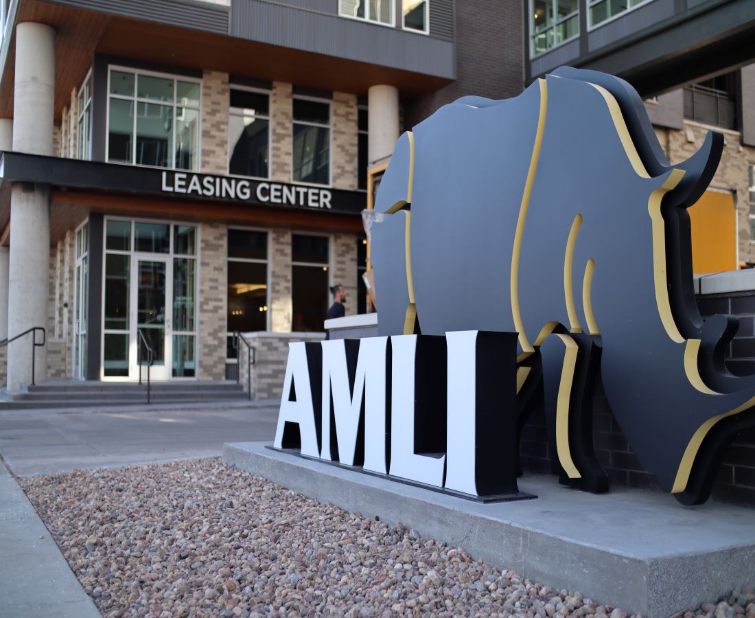
AMLI Rino Monument Day Web

AMLI RiNo – Multifamily Signage

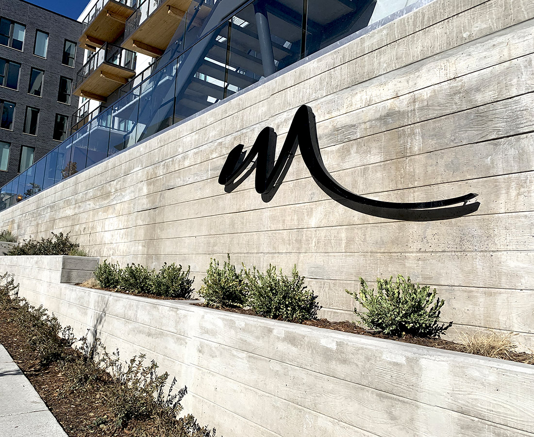
The River North neighborhood in Denver, Colorado is among the fastest growing communities in the nation.  The area, formerly an industrial hub, is home to some of the most forward thinking developments in the state combining groundbreaking architecture and next-generation sustainability.  AMLI River North, a 388 unit property located on the eastern bank of the Platte River, partnered with Ad Light to develop a multifamily signage package that drew inspiration from the area’s character and molded for a modern luxury multifamily design.

The main entry monument incorporated the community’s logo of an abstract rhino and embellished the dimensionality with a 2 layer design, standing the first layer off by an inch to allow for golden illuminated on an outlined backer.  For the graphics package, Ad Light embraced the existing graffiti and integrated it into the design by scanning the walls with a high definition camera and replicating the artwork on the new prints.  ADA signage employed raw materials such as steel and bolts to convey the industrial theme throughout while maintaining ADA standard for tactile lettering and visibility.

Projects like these are a great example of how architectural signage can carry the history of the locality while catering to the next generation of the community.

ADA thumbnail

Custom ADA Signage – 4 Materials for Stunning Designs

Custom ADA signage provides our clients with endless opportunities to broadcast their branding.  Materials ranging from photopolymer, glass, wood, and metals allow us to create custom architectural signage that enhances any environment while meeting all ADA criteria.  In this article, we’ll show you how different materials provide their own set of benefits and design advantages.


Photopolymer ADA Signage
Custom ADA Signage - Photopolymer

Custom Photopolymer ADA Sign

Photopolymer signage is the industry standard option when considering interior ADA.  It’s easy to work with, cost effective, and allows for any design to painted or printed on the first or second surface.  This is our most common interior ADA substrate and can be found in dozens of different applications from multi-family & healthcare to education & entertainment.  We have secured a partnership with Nova Polymer to source large volumes of high-grade materials which allow us to offer our clients the best pricing available and an unlimited scope of design options with customer photopolymer ADA signage.

Most ADA photopolymer signs range from 1/8″ thick to 1/4″ thick but can be ordered in 3/8″ and 1/2″ as well.  We offer an exterior grade photopolymer which is especially designed to withstand heat and direct sunlight, perfect for outdoor applications like garden style apartment buildings and exterior stair core entries that require ADA design and fabrication.


Glass ADA Signage

Ad Light is proud to be one of the only glass sign providers in the Front Range and have found our clients love this option for their interior signage projects.  Glass sets itself apart from other materials with an instantly recognizable elegance stemming from crisp edges, deep textures, and brilliant colors.  Light interacts with glass in such a way that no other material can, bringing paint colors and prints to life through clarity and dimension.  Standard thickness for glass is 1/4″ when used in interior ADA signs, but can be ordered in varying dimensions and even layered.

Manufacturing glass ADA signage is a specialized process requiring skill, experience, and premium equipment to execute properly.  The staff at Ad Light has over 10 years of experience in glass manufacturing and our understanding of the process from procurement, design, blasting, and specialized painting results in the highest level of quality in the final products. Our sandblasting machine was imported directly from Italy and has been meticulously maintained to ensure our custom glass ADA signage are manufactured to our Ad Light standard and satisfy all ADA requirements.  It’s also an outstanding material to pair with aluminum and steel.  Check out some examples of glass ADA signage from our Solana Lucent Station project here.


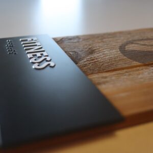
Custom ADA Sign - Wood with Photopolymer panel

Direct printed logo on wood backer with Photopolymer ADA panel

Wood ADA Signage

Wood provides an excellent opportunity to tie in architectural elements in corridors, entries, and anywhere else you might want to bring some organic design to your space.  We have seen a major shift to using wood material in our custom ADA signage and have found several ways to help our client incorporate any species of wood into their sign systems.

Conventional sign standards like individually mounted characters are still used, but 3D printed raised characters and symbols are certainly the wave of the future for ADA signage.  Ad Light is proud to offer all methods of incorporating raised characters and symbols to any material (except water, and yes, we’ve tried).  See an excellent example of custom wood ADA from our COLAB project here and another great example can be found on our Instragram page here!


Metal ADA Signage

Metals such as aluminum, steel, brass, and bronze are great options in creating stunning designs that can pair with architectural features in any setting.  It is truly amazing how many different finishes can be achieved with metal.  For example, aluminum alone can come in brushed, polished, painted, or anodized – each option having countless variations to choose from.  The expert designers and consultants at Ad Light can help choose which of these design elements will best fit your project and how we can bring your branding to life with metal signage.  See some beautiful examples of metal signage used at Fremont Residences here!


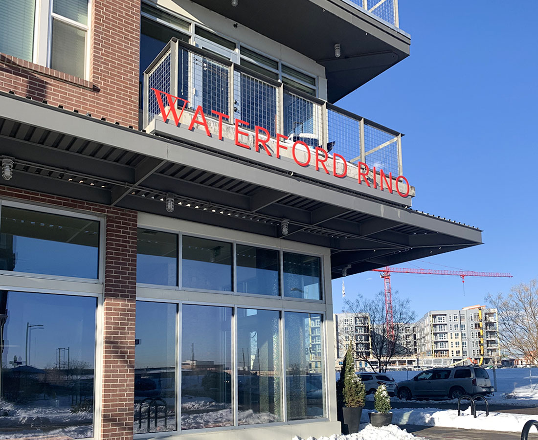
Exterior leasing address signage at Waterford RiNo

Waterford RiNo

Ad Light Group created exterior signage for this Denver property under the original development ‘The Yards at Denargo Market‘. After the name changed to ‘Waterford RiNo’, Ad Light was contracted to replace the existing signs with rebranded ones. Our team fabricated new illuminated cabinets and reconfigured the layout to accompany the additional letters of the property’s new name. After 8 years, the steel-I beams remained in great shape and were able to be reused on the rebranded sign. To complete the exterior rebrand, new parking signs and new canopy signs above the leasing center’s entrance were also completed. The project was designed, fabricated, and installed by Ad Light Group in partnership with Braddock & Logan.

Exterior letter sign at Modera LoHi

Modera LoHi

Modera LoHi, located in the heart of Denver’s Lower Highlands neighborhood, is an upscale multifamily property. Ad Light Group was contracted by Mill Creek Residential to fabricate and install all interior and exterior signage. The exterior design included a 25′ wall sign and a sleek, modern projecting sign near the property’s entrance. The interior scope included all wayfinding, restroom, room and unit ID signs. The Ad Light Group team also created and applied dusted window vinyl in the front office and colorful brick wrap graphics for the amenity rooms to provide extra branding for the shared spaces. The sign package designed by Norris Design was fabricated and installed by Ad Light Group.

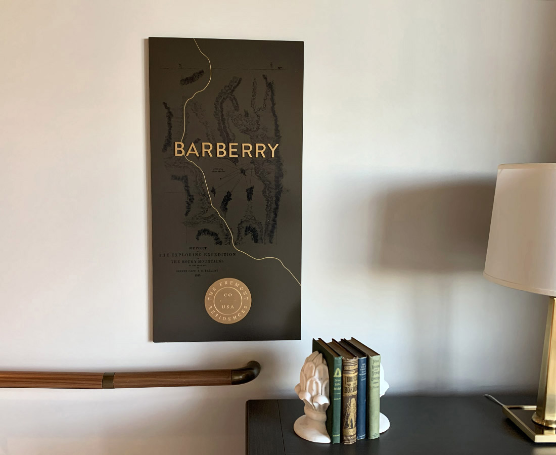
Interior building ID sign at the Fremont Residences

The Fremont Residences

The Fremont Residences is located by the Anschutz Medical Campus to provide a luxury living experience for those who work on the campus or in the area. By collaborating with Weitz Construction and Tryba Architects, Ad Light Group was able to bring a sleek and thoughtful sign package to the building with both exterior branding and interior elements. Designed by Tryba Architects, the multiple residential entrances feature custom interior building ID signs named after flowering plants. The specific plants, including Cottonwood, Barberry, Phacelia and Yellowray were first classified by John Fremont during his mid-nineteenth century expeditions. The rest of the interior package was created with glass ADA signage, aluminum substrates and stainless-steel with various finishes.